Elevate Your Web Design: The Float Effect
Elevate Your Web Design: The Hover Float & Scale Effect
In the realm of web design, interactivity plays a crucial role in crafting unforgettable user experiences that stand out. A straightforward yet impactful method to infuse your website with a dynamic flair is through hover effects. Today, we explore a simple yet powerful hover effect that gives elements the illusion of floating, slightly scaling, and gliding in a specified direction—all with a seamless and sophisticated transition. The greatest advantage? It's lightweight and relies solely on pure CSS!
Why Use Hover Effects?
Hover effects are more than just eye candy. They:
- Enhance user engagement by providing instant feedback when interacting with elements.
- Direct attention to specific areas, such as buttons or clickable cards.
- Create depth and polish, making your site feel modern and professional.
The Float & Scale Effect achieves all of these benefits, making it perfect for buttons, images, or feature cards.
How It Works.
The effect integrates three essential CSS properties:
- transform: Shifts the element, creating the illusion of movement.
- transition: Guarantees that the alterations unfold seamlessly over a specified duration.
- box-shadow: Provides depth to emulate the element rising from the page.
Step-by-Step: Create the Hover Float & Scale Effect
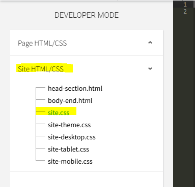
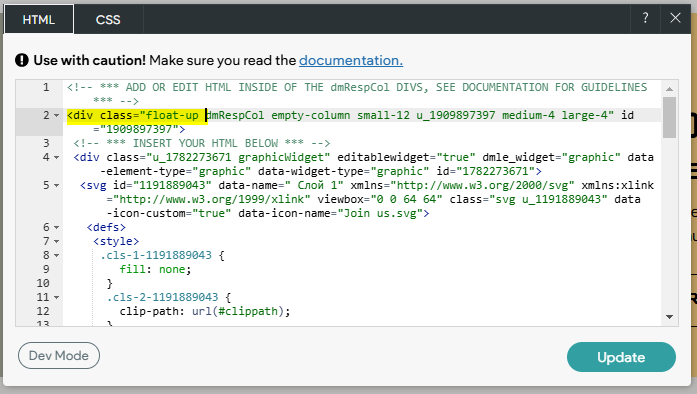
Implementing this concept on a Duda website is quite straightforward. We aim to apply the CSS to either the specific page or the entire site, depending on where you wish the effects to take place. For a sitewide effect, it's best to place the CSS within the site.css folder in "Dev Mode." If you're uncertain about how to access Dev Mode, just click the </> Icon located in the top Context Bar of your Duda Editor. Once you're in Dev Mode, navigate to the site.css folder from the left sidebar.
Step 1: The CSS
Insert the following code into the site.css folder of your website. This can be accomplished using either the classic editor or the new 2.0 editor. Remember to include the pesky !important that Duda appears to need.
/* Base float effect - add smooth transition */
.float-up, .float-down, .float-left, .float-right {
transition: transform 0.3s ease, box-shadow 0.3s ease !important;
}
/* Float directions with scale */
.float-up:hover {
transform: translateY(-10px) !important;
box-shadow: 0 8px 15px rgba(0, 0, 0, 0.2) !important;
}
.float-down:hover {
transform: translateY(10px) !important;
box-shadow: 0 -8px 15px rgba(0, 0, 0, 0.2) !important;
}
.float-left:hover {
transform: translateX(-10px) !important;
box-shadow: 8px 0 15px rgba(0, 0, 0, 0.2) !important;
}
.float-right:hover {
transform: translateX(10px) !important;
box-shadow: -8px 0 15px rgba(0, 0, 0, 0.2) !important;
}
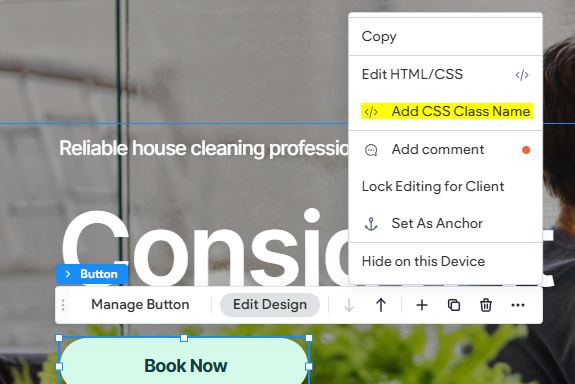
Step 2: Adding the Classes
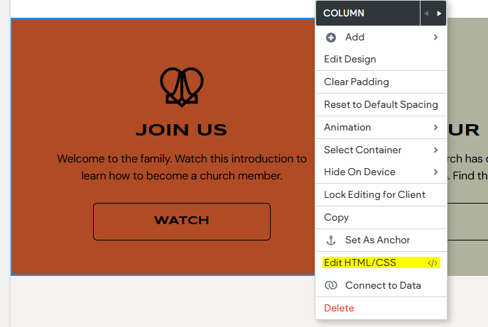
After pasting the code into the folder, it's crucial to learn how to "Edit the HTML/CSS" of an element. The 2.0 editor currently faces some limitations regarding the modification of the HTML/CSS for a flex element. However, Duda offers an excellent feature that allows you to seamlessly add a custom class name to any flex element. You can assign the Class Name to any element you desire, whether it's a Button, Image, Title, Column, or anything in between! The effect will become apparent when you hover over this element. The classes in this case are as follows.
- float-up
- float-down
- float-left
- float-right
Remember when adding a class to the html of an element, you do not need to add the . that starts each class in the CSS. So for the .float-up effect, the class to add is float-up
Breaking it down.
- transform: scale(1.05): Enlarges the element by 5%, producing a gentle pop effect.
- translateX() and translateY(): Shifts the element in a defined direction (up, down, left, or right).
- box-shadow: Creates an illusion of depth by placing a shadow below the element.
- transition: Eases the effect over 0.3 seconds, resulting in a refined and polished appearance.
Where to use this effect.
This effect is excellent for:
- Call-to-action buttons: Enhance their visibility to drive clicks.
- Feature cards: Introduce subtle interactivity to highlight key content.
- Images: Develop an engaging gallery or portfolio.
Keep in mind that when incorporating animations, LESS IS MORE! While their eye-catching allure may tempt you to inundate your website with sleek and appealing animations, it's best to use them judiciously.
Customizations
Experiment with more vibrant or colorful shadows. We like to use this shadow generator to design shadows for our elements. Once you create your shadow, apply it to the floating classes. You can also edit the Scale size, as well as the speed of the animation.
.float-up:hover {
transform: scale(1.05) translateY(-10px) !important;
}
.float-up:hover {
box-shadow: 0 8px 15px rgba(0, 0, 0, 0.2), 0 0 10px rgba(255, 255, 255, 0.5) !important;
}
transition: transform 0.5s ease, box-shadow 0.5s ease !important; (0.3 to 0.5 is a standard transition timing).
Final Thoughts.
The Hover Float & Scale Effect is an incredibly powerful tool that can significantly elevate your web design, making it an essential addition to any developer's toolkit. Its understated yet impactful nature introduces an engaging element of interactivity that captivates users and draws them into the experience. With merely a handful of CSS lines, you can not only enhance the appearance of your site but also improve the overall user experience, transforming it into a more vibrant and contemporary platform that stands out in today’s digital landscape.
So, why not give it a try? Dive into the world of hover effects and showcase your creative designs to your audience with confidence. Let’s embark on a journey towards superior web design, one hover effect at a time, and watch as your website comes to life, leaving a lasting impression on every visitor.
See the Effects